There's also a bundle of options for your menu layout and colours - for both the normal large screen menu display, as well as the mobile-friendly off-canvas mobile menu options.
Configure your menu options in the templates admin settings area, under the Menu Settings tab.
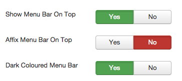
Main Menu Options
Colours
Each of the Bootswatch themes featured in the template have their own colours, tweaks and styling individual to their own stylesheets. You can also select whether you want the default or inverse (usually light/dark) theme for the menu - depending on how you want your menu to look.
Additional to this, your colours for menu items, links, etc can be further styled by selecting options under the colour styles - a default set of overrides to give a bulk change to the colours used for default layout items like the menu. There's also more overrides you can do without having to get near any code .... with additional options on the template admin area's "Colour Customisation" tab.
Position
The template itself has a default menu position - under the logo, search bar and within the header.
There is also a setting in the template menu parameters that allows you to set the menu as "TOP", like this demo ... and additionally if you want it affixed, meaning it stays visible at the top of the page all of the time - being affixed.
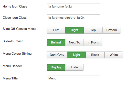
Mobile Menu Options
There's a LOT of options for your mobile menu ... extra module positions above and below the actual menu, placement, animation, theme and more.
Please view the current options below.
Using Iconfonts in the Menu
Joostrap supports both Fontawesome Icons and Glyphicons by default in the menu settings.
There are complete instructions on how to do this in the "Menu" tab of the template ... but essentially, you just put your icon class (eg. fa fa-home) in one of the menu items text fields and the icon displays - all done, as easy as that ;)